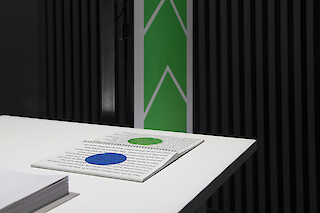
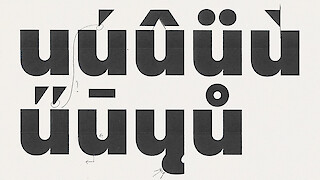
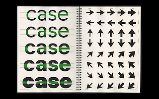
Typography in the context of wayfinding is a crucial element in the way we interact with our environment. Through reading, one has the ability to navigate in and out of current spaces. Therefore typography can interact with its surroundings. How are movements able to shape a typeface and its readability? Direction, distance and speed are key factors in how one perceives text. Those parameters determine the design of the typeface and factor in the proportions of the letters. The typeface can adapt to different circumstances and is able to interact with surrounding movements. The project is based on railway typefaces and incorporates the nature of the crude grid structure paired with sensibilities from human-derived movements.
Samara Keller has produced an outstanding work which appeals through its concept and formal aesthetics. From the smallest design elements such as the design of a letter’s curve up to the identity-generating application in the context of traffic, the project presents an impressive, overarching view of the history of the Romans, the tradition of typography in Switzerland, the craft of typeface design and the future of mobility, thereby outlining a momentum of national identity formation. The project provides an excellent basis for further interdisciplinary research on the circumstances of navigation in road traffic and about weighing up the formal, technical and ergonomic aspects of typography in this area. – Excerpt from the supporting statement of the Subject Area in Visual Communication

«‹Itera› shows the impact typography can have on identity and the perception of identity. The combination of using a system and a playful approach to reading habits are part of the basic framework of typeface design.» – Samara Keller

«I very much see my future in type design and would like to carry out further research into the different ways in which typefaces can be applied.» – Samara Keller
