Bitte aktualisieren Sie Ihren Browser zur korrekten Anzeige dieser Webseite.

Yiddish Displayed

A Typographic Experiment through the Yiddish Language

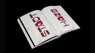
«Yiddish Displayed» is an experimental typographic project based on Yiddish, the ancient language spoken by Ashkenazi Jews that represents a bridge between the German and Hebrew worlds. Inspired by the typographic elements derived from the Latin style of previous eras, the project lays the foundations for a «Yiddish Display Type Foundry» in which the typefaces are bi-scriptual (Latin and Hebrew) in accordance with the three languages German, Yiddish and Hebrew. An accompanying publication highlights the history and culture of the language, along with its position between German and Hebrew. It serves as a type specimen as well as a digital transcription tool to engage in a contemporary discourse on the topic.

Interview.

This work is a multiscript solution of an extraordinary kind. It does not just combine two different typographic systems, but also two languages and cultures – and even goes beyond this by creating a completely new script and thus new characters for the language of «Yiddish».

Link:
visualcommunication.zhdk.ch/diplom-2021/yiddish-displayed
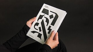
«Yiddish Displayed». Publication cover.
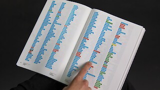
First part of the publication. Vocabulary examination of the non German words in Yiddish.
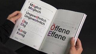
Second part of the publication. Linguistic examination and similarities between German and Yiddish.
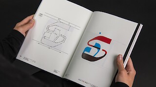
3rd part of the publication. The Hebrew and Latin script, compared and combined.
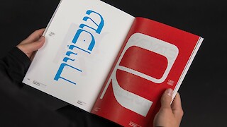
4th part of the publication. Type specimen the three bi-scriptual typefaces.
Spread from the 4th part of the publication, Yiddish and German words compared visually.

«I want to be a graphic and type designer using my design methods to create a bridge between different cultures, views, languages and opinion.» – Noam Benatar

Noam Benatar
For the past 8 years, I have been working in the field of graphic and type design in various settings, ranging from my military service as a designer in the IDF Spokesperson unit, to an art director in an advertising agency, and academic studies. My design works show strong interest in the worlds of letters and shapes, and the use of typographic elements plays a key role in my design. As a native Hebrew speaker, I am fascinated by culture crossing in graphic design as well as the world of multi-scriptural and multi-linguistic typefaces, topics which are in constant research in my present work and probably also in future projects.

noambenatar.com
@noam.benatar