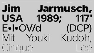
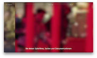
Despite the rich history of subtitles – from their origins in silent films to their current, autogenerated form on video platforms – subtitles for films have unfortunately remained untouched by design efforts and unaesthetic to this day. This is the reason why in a 250- million-dollar movie production you might well come across bizarrely distorted subtitles in Arial at the bottom of the screen.
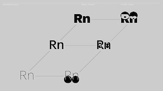
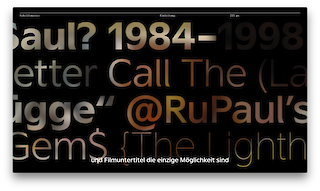
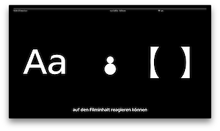
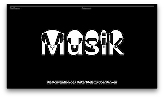
«Subtype» is a new, user-friendly film subtitle font adapted to the medium, specifically designed for use on video and streaming platforms on the internet. In 2020, subtitles no longer need to be static, but should instead respond to content as well as dialogue. Especially for the deaf, variable subtitles are offered, which integrate details about dialogue volume, music played and background noises directly into the typeface to make information that is difficult to interpret more comprehensible.
In this sharply defined concept, current technological developments are seized as an opportunity and applied innovatively, appropriately and with the highest regard for quality. The scope of competency shown in this work reflects the content and design range of Visual Communication – from the curve of a letter and the animation of a family of fonts to the speech-controlled application using the latest digital advancements. The jury was also impressed by the clear and professional way in which the work was presented.
Websites:
filipdespotovic.ch
visualcommunication.zhdk.ch/diplom-2020
